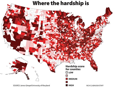
Patchwork Nation is a fascinating, ongoing monitor of 11 different community types in the United States. As I understand it from one of the blog proprietors, Dante Chinni, Patchwork Nation which is based at the Christian Science Monitor has established a broad set of criteria sensitive to all sorts of economic and life shifts.
But this past week, their charts began to basically scream red — all sorts of major shifts in the country. Read more on “Gloomy Economic Picture Worsens.”
— Steve Clemons

7 comments on “America’s Hardship Map”